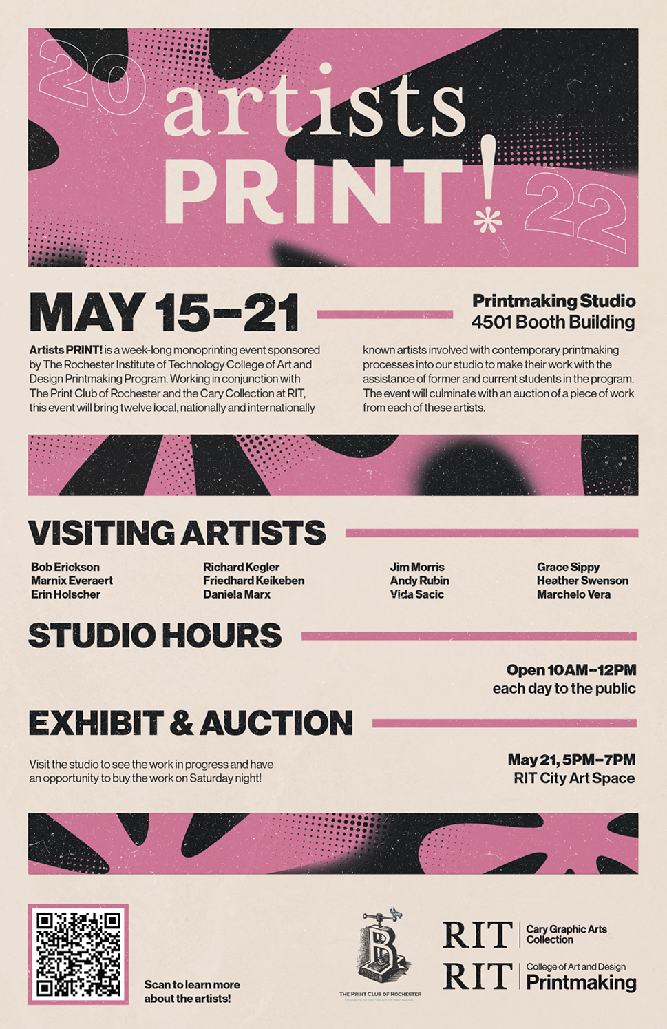
artists PRINT Monothon Event!


This series was created while at MIAD as a visiting artist. I started to experiment with toner drawings in screenprinting. I’ve used toner drawing in lithography but not in screenprinting. It creates a different kind of methodology, which has been interesting to explore these last few weeks.

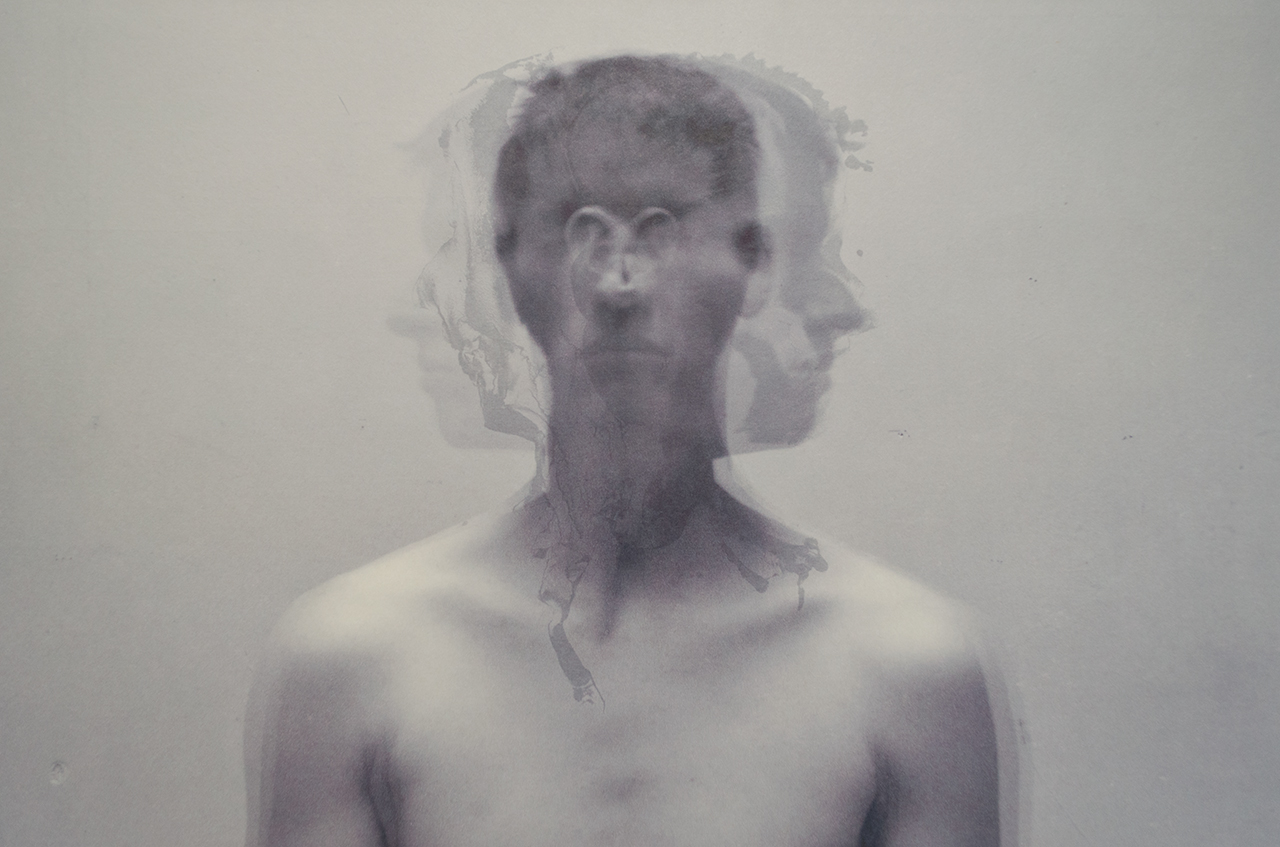


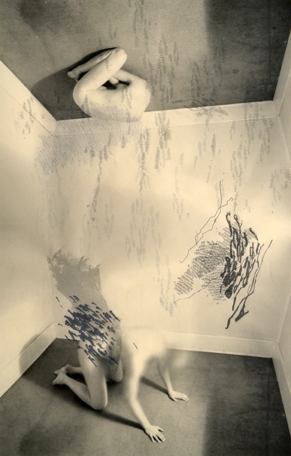
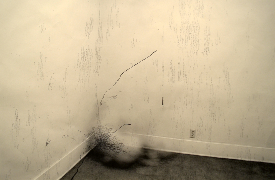
The works in Entre Chien et Loup could exist within a dream, memory, hallucination or within the human psyche. In these prints, figures dwell within hidden or underlying spaces and speak to states of serenity and disorder, challenging us to consider what we are seeing as controlled or uncontrolled, real or illusory, something familiar or frightful. Using motifs of doubles, mirroring, deformation, dematerialization, instability and various mark-making, the work speaks with a visceral language.
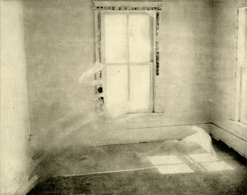


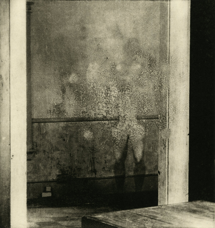
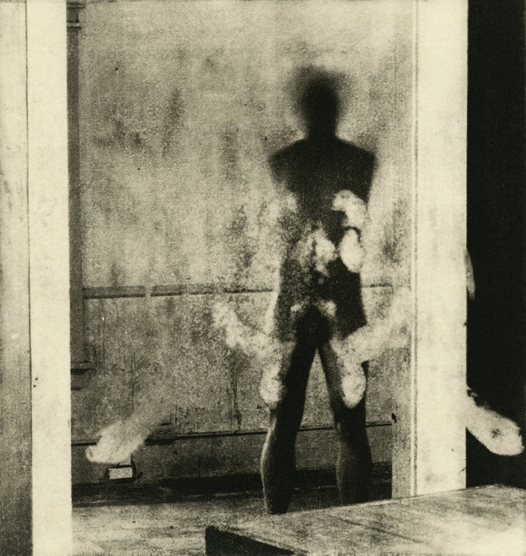


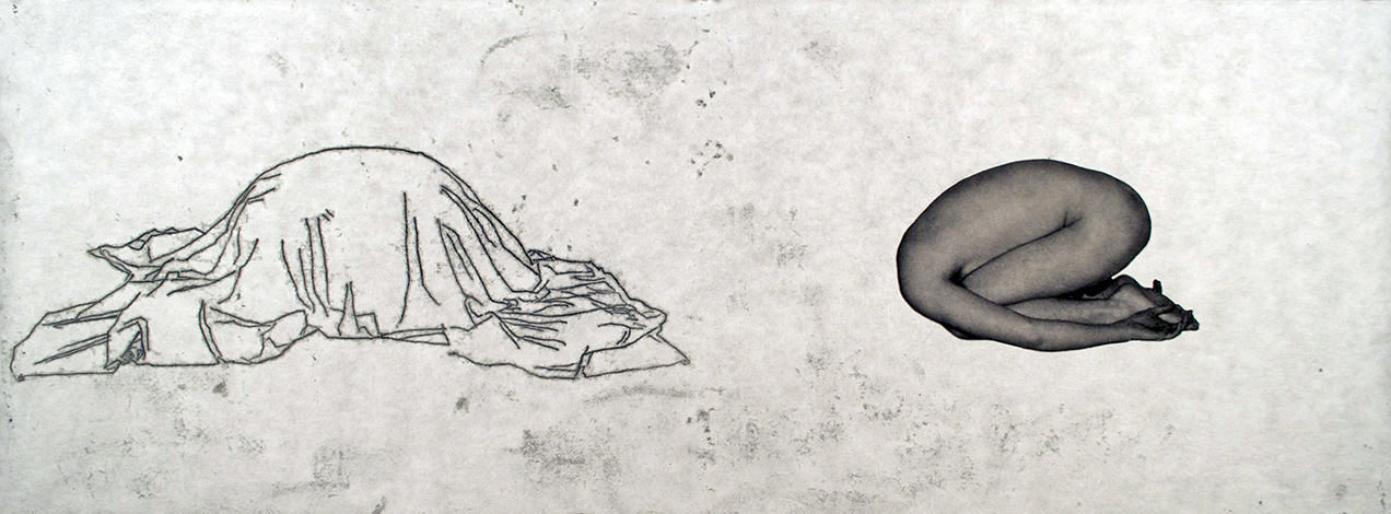
In the Flux series, the figures and the spaces they reside are either hallucinations or speak to states of a psyche in turmoil. The figures are in a space that can be viewed as dreamlike or a kind of psychological space. They are psychological spaces but are meant to induce physical reactions, bodily reactions one expresses during intense distress, anxiety, and instability. The marks help indicate this as an energy or aura. I chose to use silkscreen as a medium for methodological purposes but also because the mark could reflect the textures of the space they were used in. All works in this series are a combination of digital inkjet, screenprinting, and chine-collé on Hahnemühle printmaking paper.


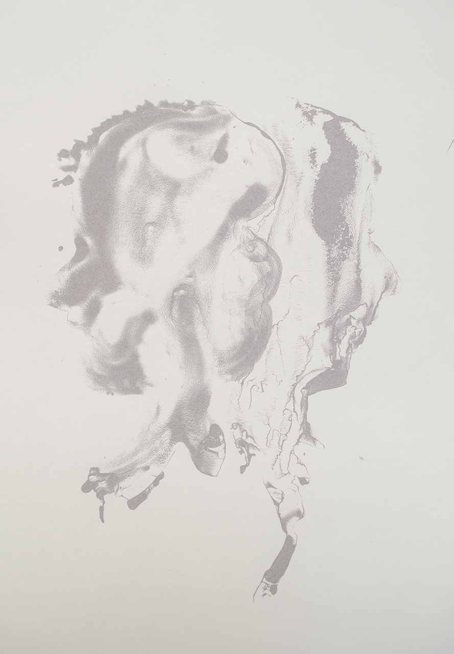
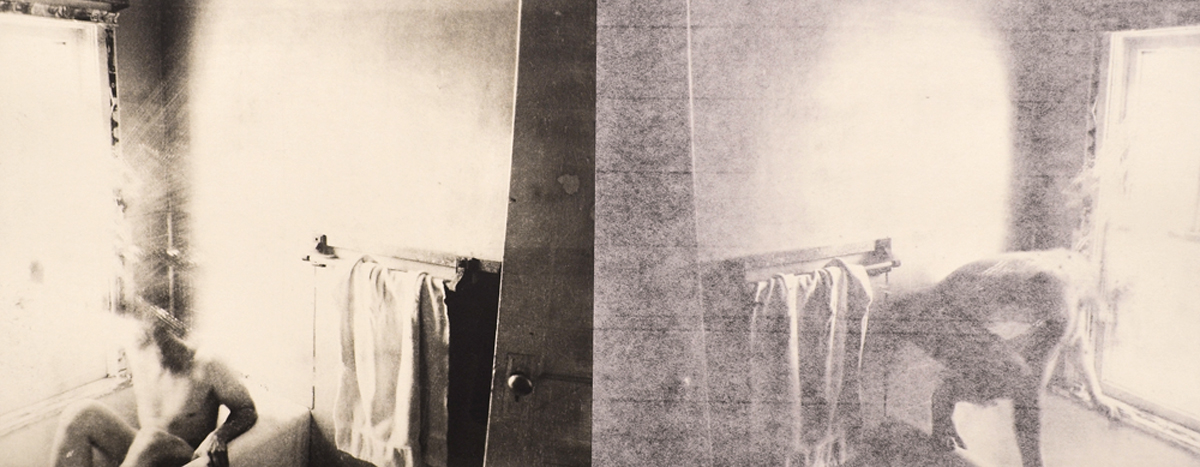
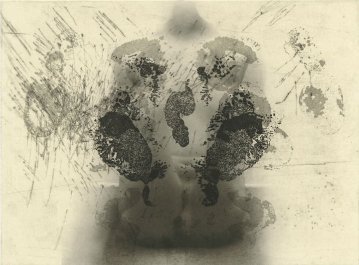
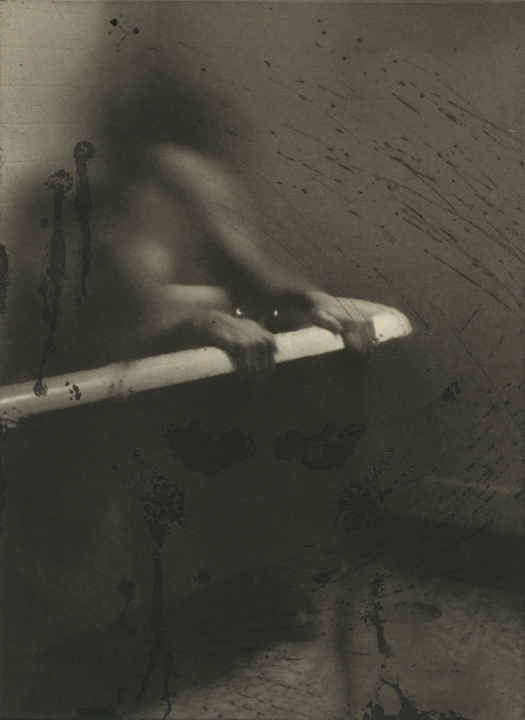
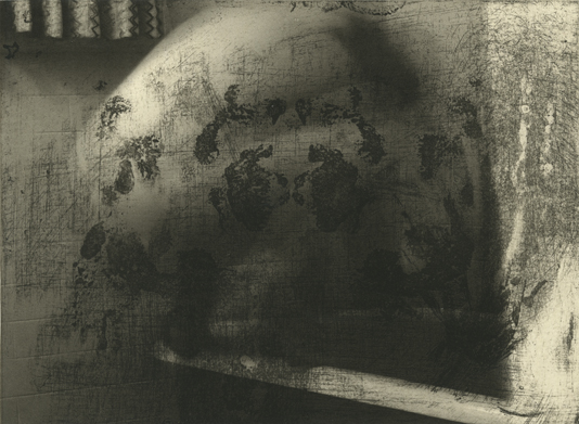
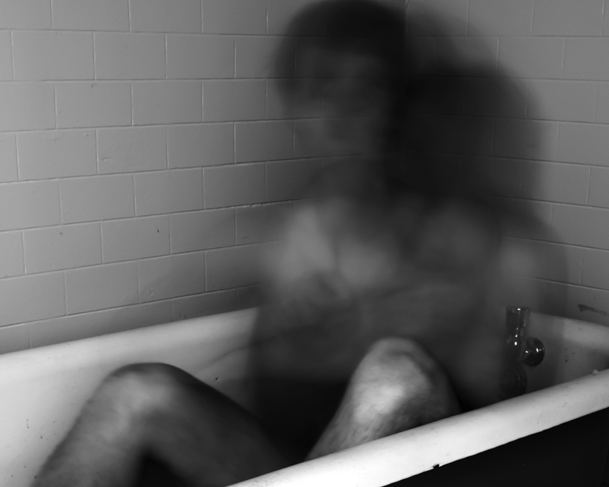
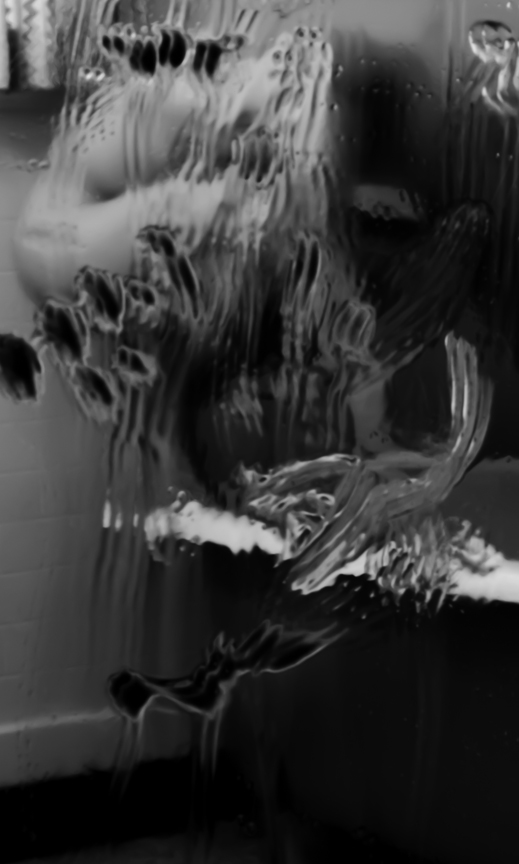
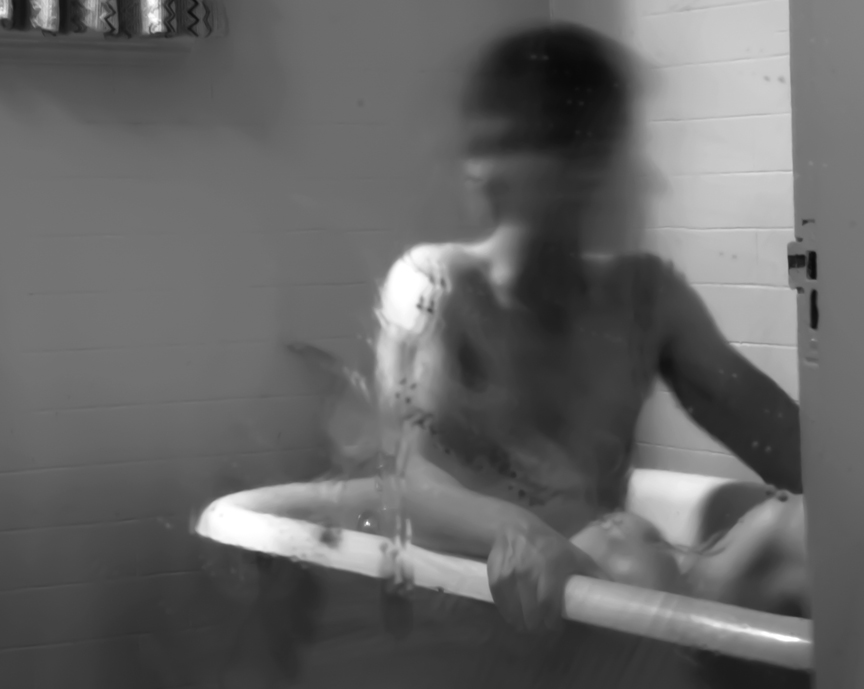
Mirrors are objects that convey two sides, and show one’s reflection. Conceptually, my images are revealing/reflecting one’s Self image or parts of ourselves that remain hidden. Using motifs of doubling, reflecting, and symmetry/asymmetry in my images also speak to what a mirror means and continue to be visual motifs in my work. In the Mirror series, Rorschach blots were an inspiration to use as a visual element, which of course is a reflection of its own form. Intaglio was a wonderful choice for this series since it capable of a wide range of visual languages. This gives the surfaces and marks needed in the Mirror series a richness and variety. The photographic component in the work came from photo sessions. I am interested in the bathroom and the idea of cleansing deformities, imperfections, and having the figure in a place of privacy and helplessness. All of the work in this series were combinations of digital inkjet on Honen paper, printed on using various traditional intaglio techniques and chine-colléd onto Somerset Satin paper. Between Wake and Sleep required an additional plate to create the embossed marks.


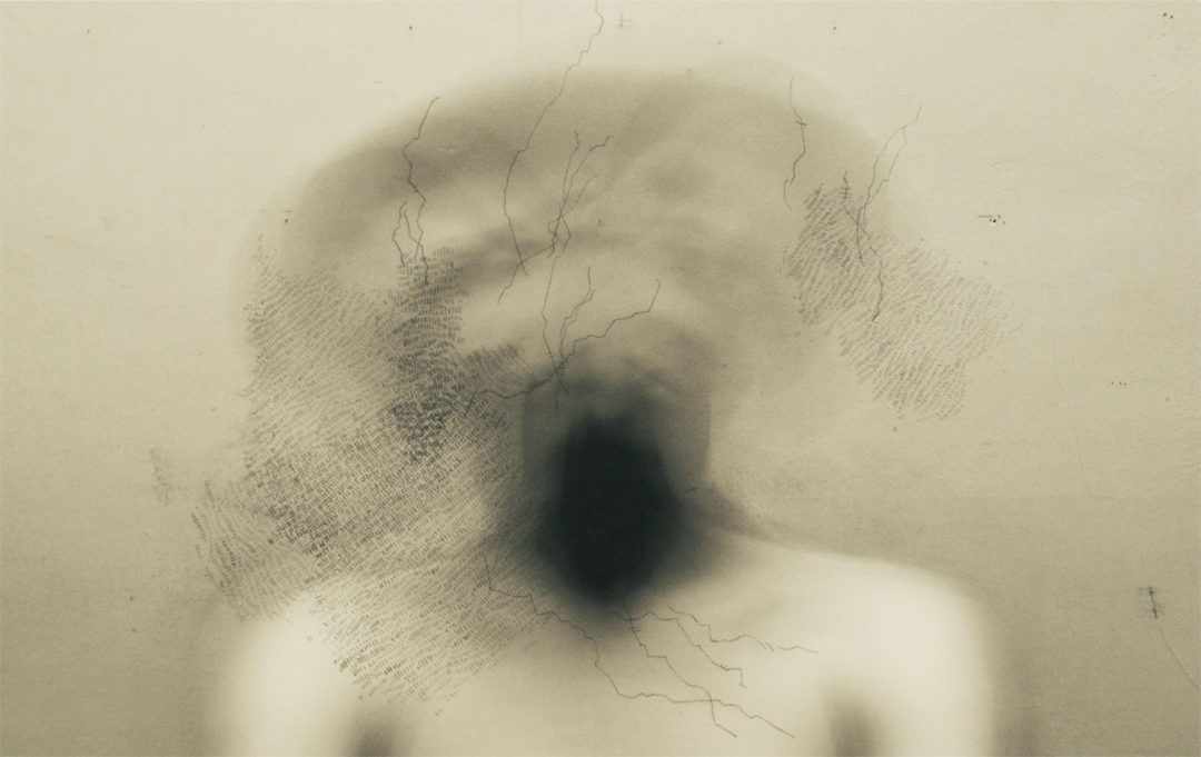
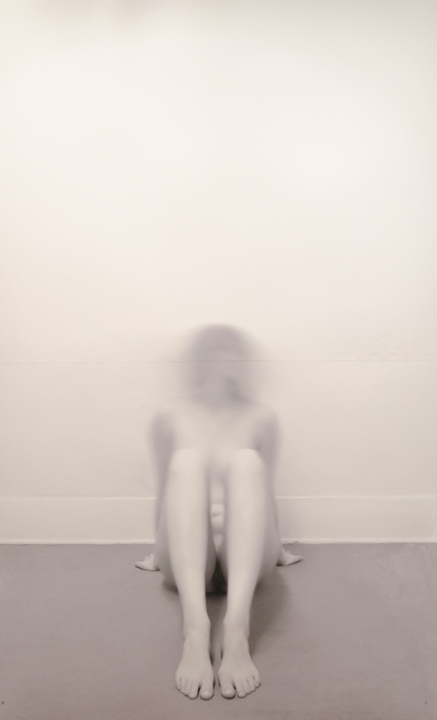
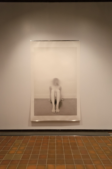
Parallels takes on a different perspective for the viewer. The figure in the space may not be referencing a psychological space necessarily, but psychic portraits in which the viewer is witnessing. It is not obvious if the viewer is seeing a glimpse inside a psyche or a sight of someone in various stages of psychotic breakdown. Like the Flux series, there is a tension with the figures and speak towards instability. The size of the figures is an important aspect of the work; in life size, the viewer is likely to feel empathy at some level or evoke feelings of fragility. This series is unique in that the work is mounted onto an aluminum panel which hangs the image a few inches away from the wall, without the visual constriction of a frame. All the works in this series were digital inkjet printed onto Somerset Satin, which was then mounted on aluminum panels.


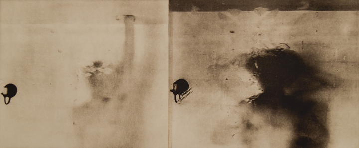
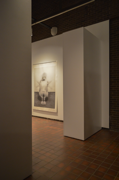
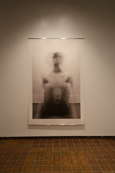
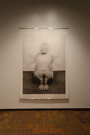
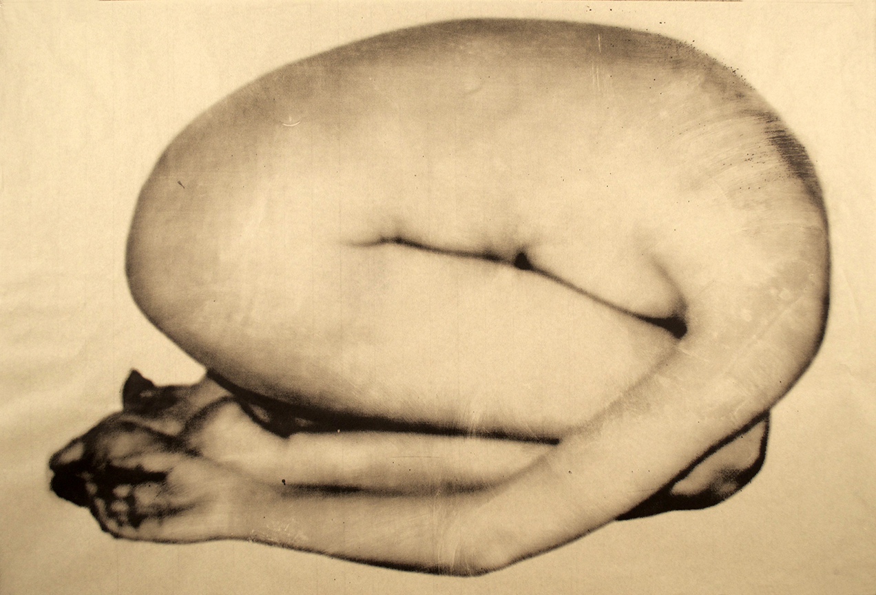
The Others, is intended to be experienced as an installation. Selective lighting, a small viewing space, and keeping the bottom of the prints unfixed were all conscious choices to prompt an uncomfortable experience. Their size is life-size or larger to give them an intimidating presence through their monstrosity and deformity. These prints are very large, each consisting of two digital inkjet prints (printed on bleached Mulberry Thai paper) chine-colléd by hand onto Somerset Satin paper.


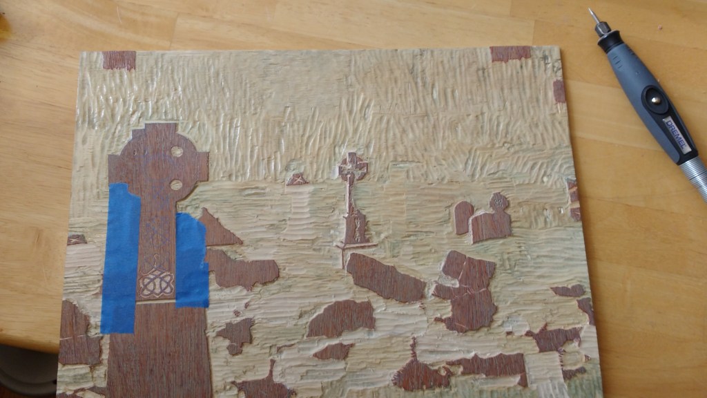
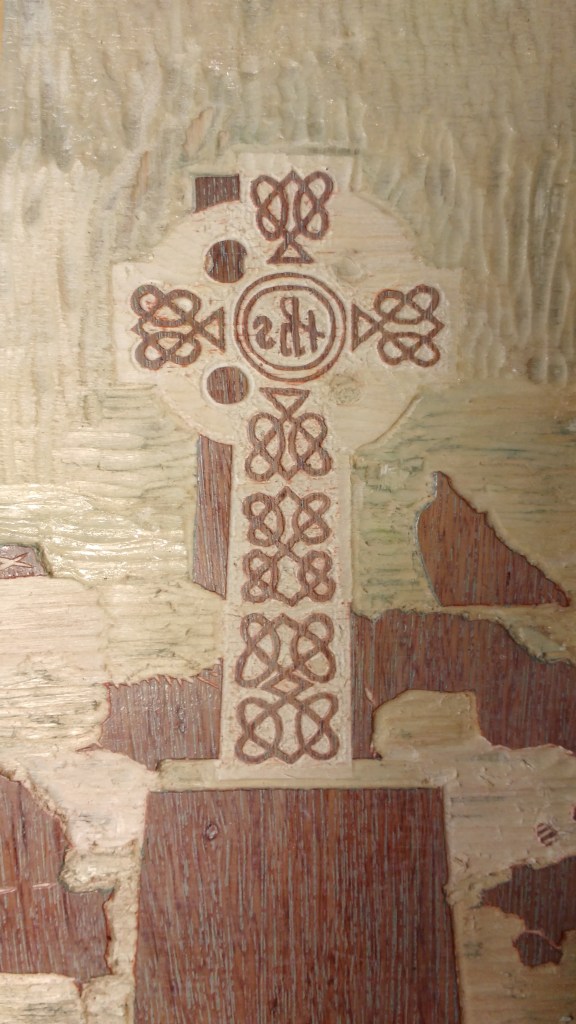
Corcomroe Abbey, Co. Clare, Ireland
This commission was to create woodcut print from a photo from Ireland. Consisting of 10 layers, it was printed on unbleached Mulberry Thai paper. The editioning had two variables, with two in each variable. There was also an AP.
The woodblock (a deep woodgrain), colors and paper were chosen to reflect the experience of being in that place. It is a place of deep history, memory and solitude.
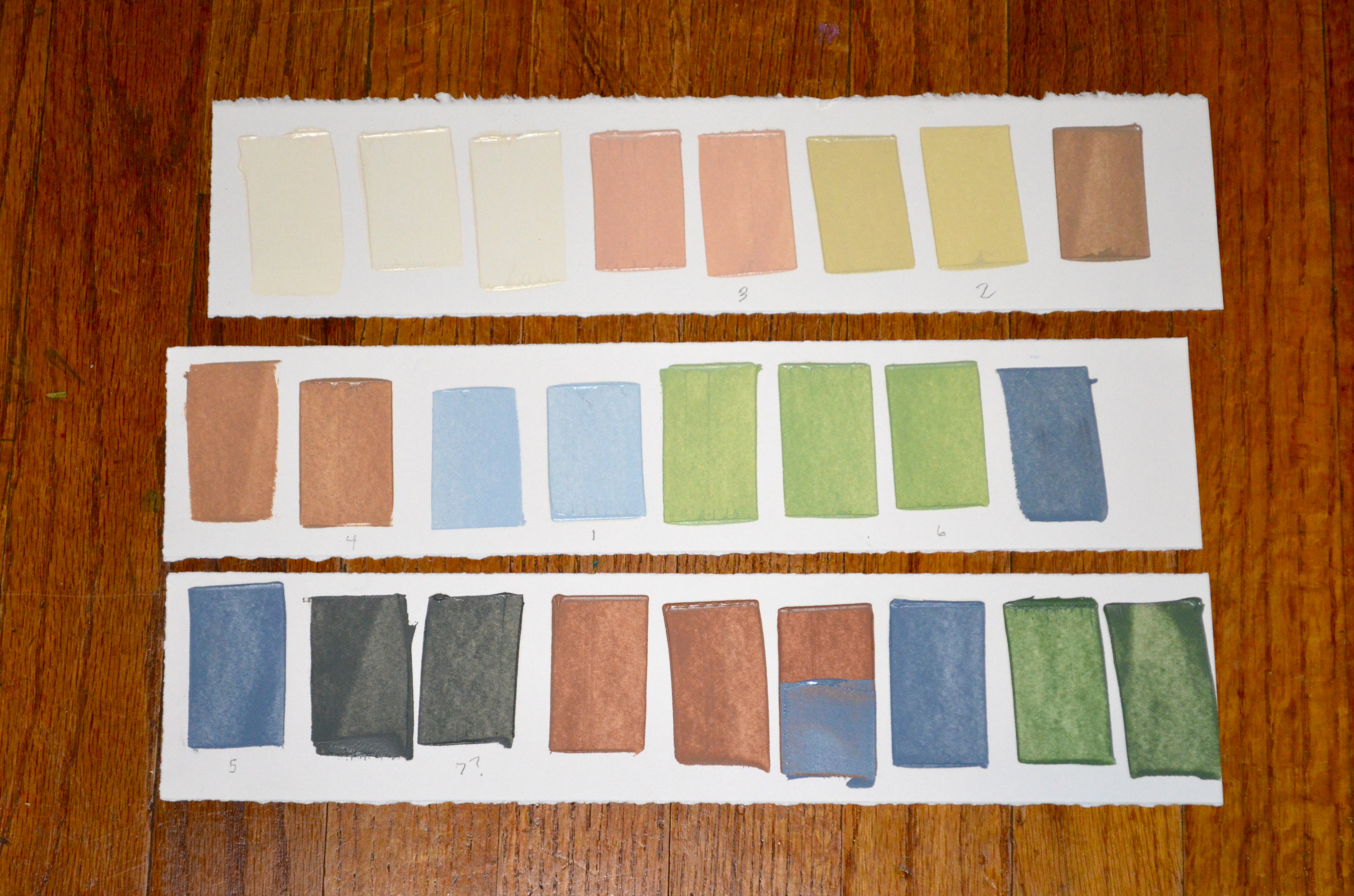
I’m not going to try and explain this mixing process now but at least say that the ones on the right were to match or modify the ones on the left because I did not mix enough ink initially…

Using stencils


A progression of layers…


")


")


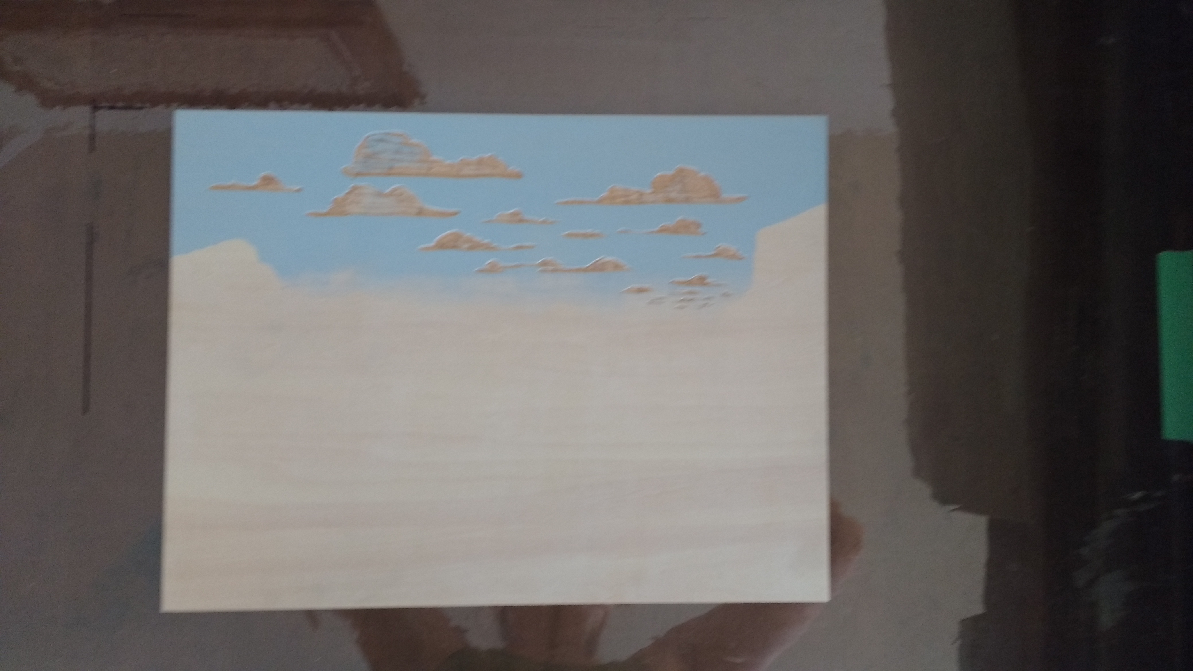
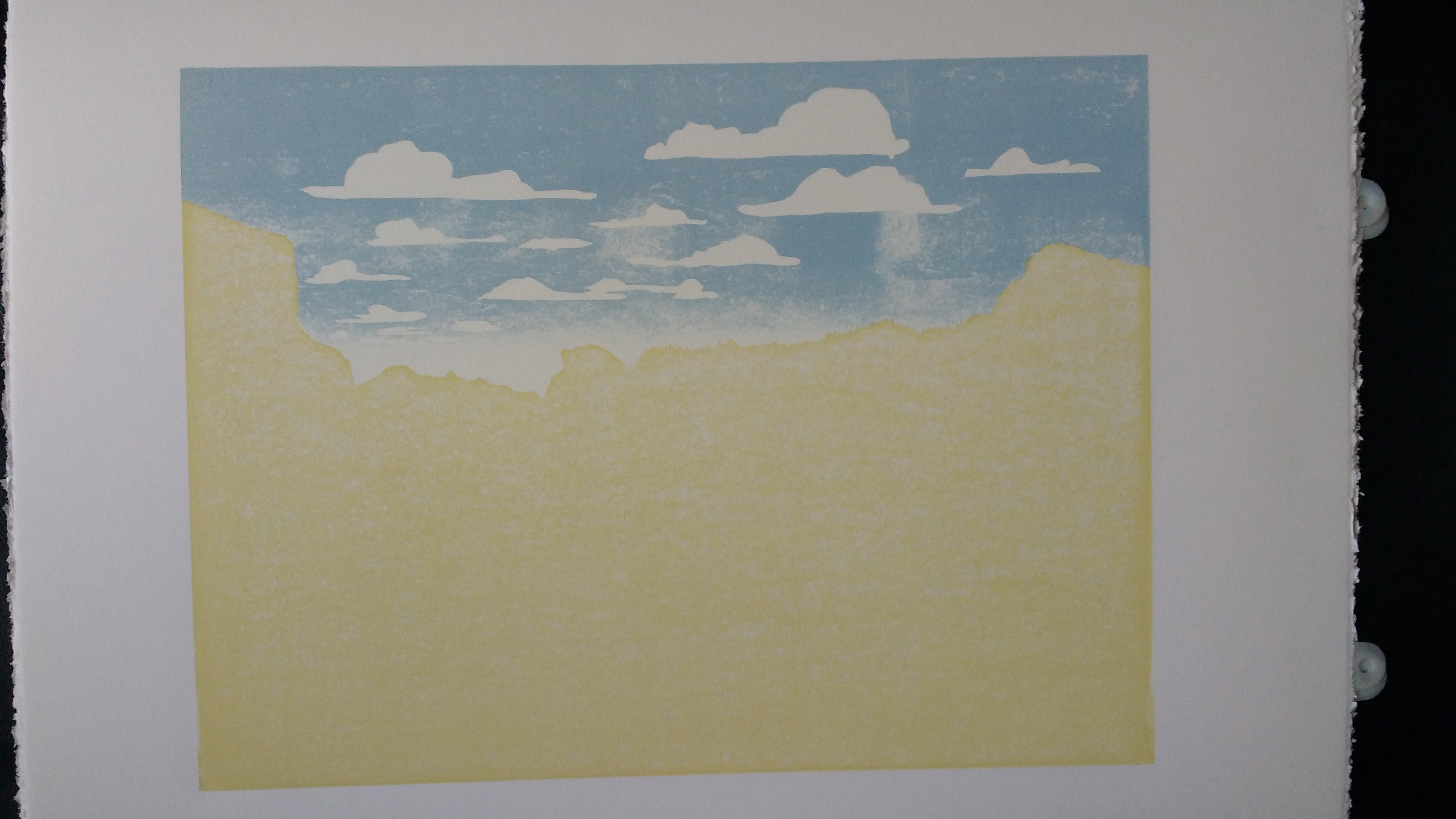
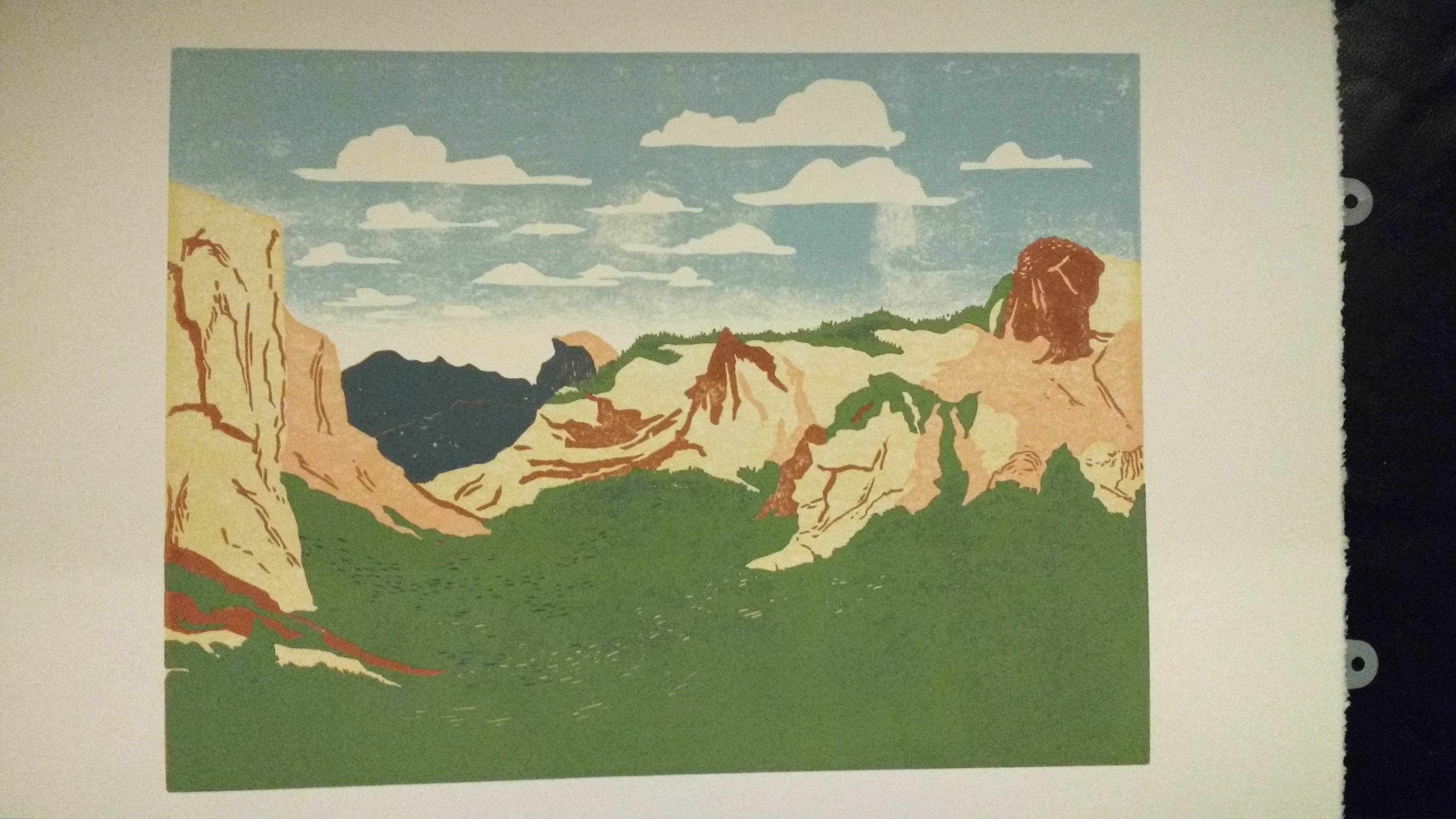
Yosemite Valley
This commission was to create a woodcut print of the famous Yosemite Valley. The edition is variable with 7 prints, was printed on Stonehenge White, and consists of 9 layers, the second and last using a stencil. This print’s colors were inspired by the Work Projects Administration (WPA) posters of the National Parks, created between the mids 30s – 40s. A smoother piece of wood was selected to minimize woodgrain, but still providing some texture.