This commission was to create woodcut print from a photo from Ireland. Consisting of 10 layers, it was printed on unbleached Mulberry Thai paper. The editioning had two variables, with two in each variable. There was also an AP.
The woodblock (a deep woodgrain), colors and paper were chosen to reflect the experience of being in that place. It is a place of deep history, memory and solitude.
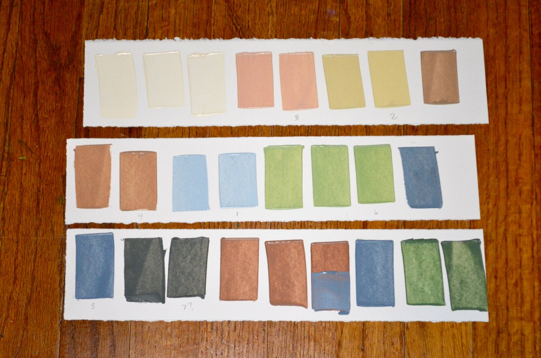
I’m not going to try and explain this mixing process now but at least say that the ones on the right were to match or modify the ones on the left because I did not mix enough ink initially…
Using stencils
Aligning the stencil
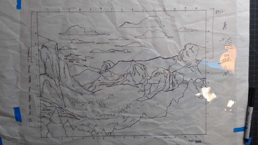
Master sheet for Corcomroe Abbey
The arrows indicate that I need to cut on the outside of the line, rather than the inside.
A progression of layers…
Corcomroe Abbey – layer 1
Corcomroe Abbey – layer 2
Corcomroe Abbey – layer 3
Corcomroe Abbey – layer 4 (Stencil layer for version 1)
Corcomroe Abbey – layer 5
Corcomroe Abbey – layer 6
Corcomroe Abbey – layer 7
Corcomroe Abbey – layer 9 (I forgot to photograph layer 8)
Corcomroe Abbey – layer 10, stenciled layer. The image needed more definition, so I cut a stencil from mylar that would show linework on the stone and a detail on the Celtic cross
Using transfer paper, I transferred the details of the cross onto the wood. The quality of the wood and the size required me to use a dremel tool.This is the state the block was in for layer 9.Midway progress on the Celtic Cross.The final stage of the Celtic Cross. This took an entire day to carve.
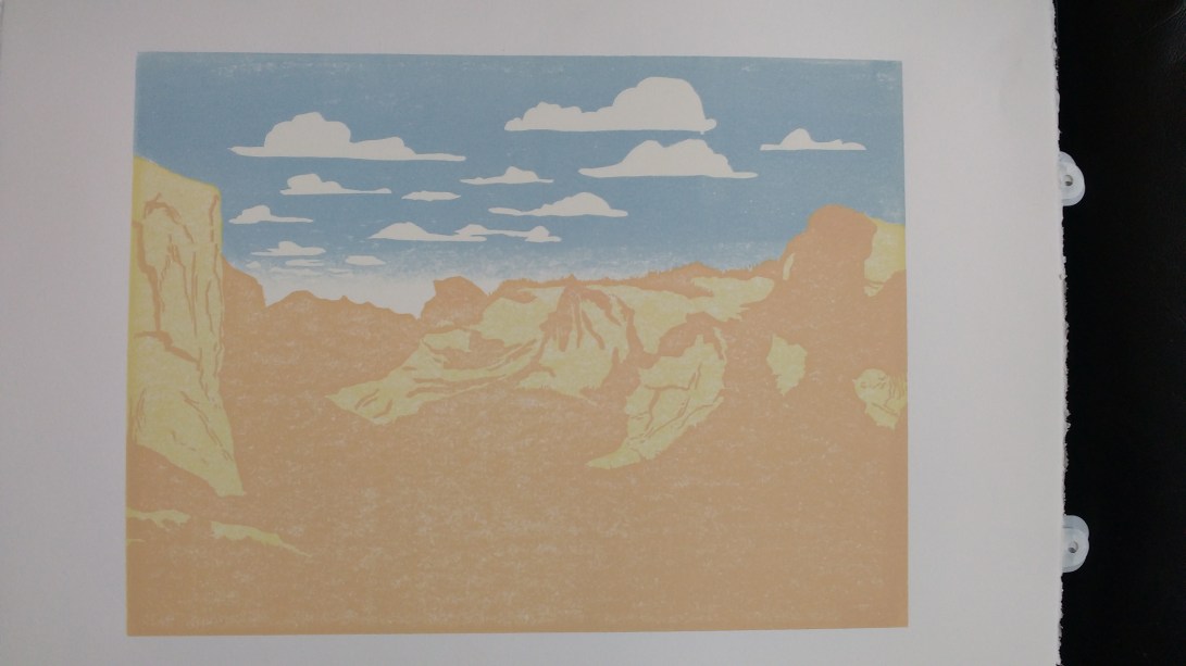
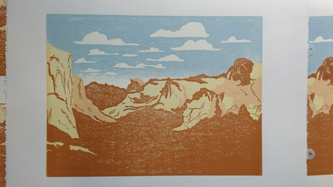
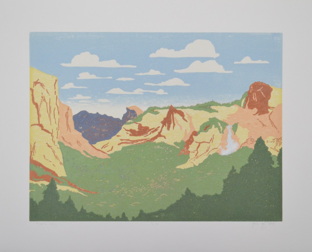
Yosemite Valley
This commission was to create a woodcut print of the famous Yosemite Valley. The edition is variable with 7 prints, was printed on Stonehenge White, and consists of 9 layers, the second and last using a stencil. This print’s colors were inspired by the Work Projects Administration (WPA) posters of the National Parks, created between the mids 30s – 40s. A smoother piece of wood was selected to minimize woodgrain, but still providing some texture.
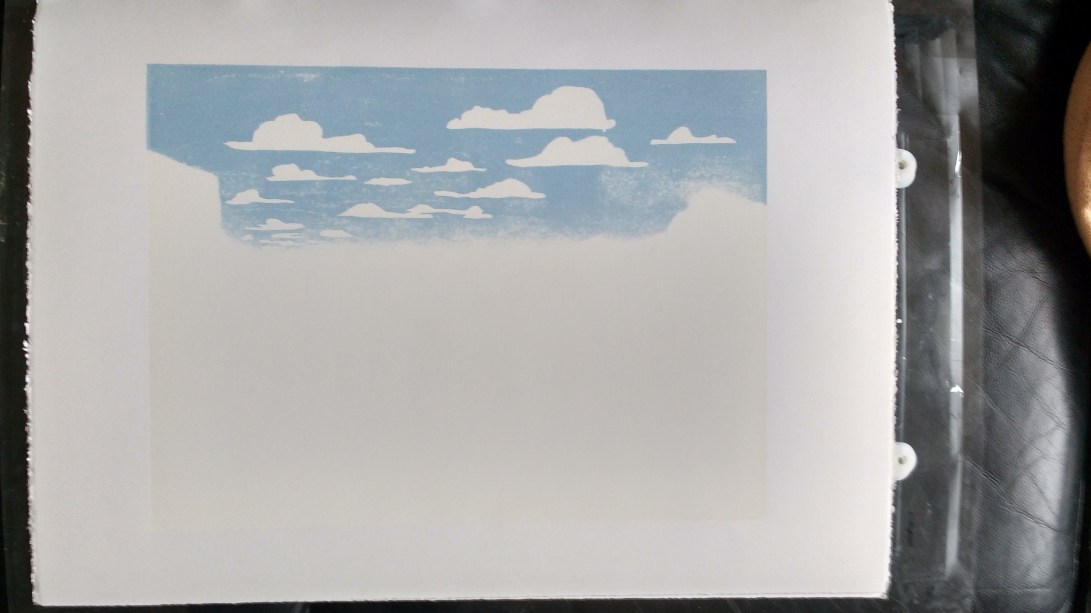
For the Yosemite Valley woodcut, I used a different registration than Corcomroe Abbey (which would have benefitted more since it had more layers to register). I used tabs and pins. The pins were attached to a piece of wood, with a 90 degree section cut out. This removed section is where the woodblock goes. The book was a paperweight while I checked this initial registration. Each piece of paper had to be registered and checked.The pencil mark is supposed to line up with the cut in the board. (Shown a little off-register).I use master sheets for my woodcuts to transfer the image onto the woodblock for each layer. As each layer is printed I mark it off on the sheet. This is drawn in correct reading, and is how the print will look. Each time I draw a layer I flip the sheet over to reverse, because the printed image is a mirror image of the block. I write notes on the sheet so don’t forget this when I’m in printing mode.The block and master sheet are aligned with the pins. Each layer requires its own drawing, so I do this step each time I transfer the image from the master sheet to the block. I then carve that section from the block.This layer is barely perceivable (look at the top left) but a warm cream color was printed as the first layer to unify the colors printed afterwards.This blurry image is of the first layer on the block, which I used a stencil for. The stencil protected the lower part of the block from receiving ink, so the blue ink was only applied to the upper section. I did this because I wanted a soft gradient for the sky’s edge; if this was carved, it would have a crisp edge.


")


")