McKnight Artist & Culture Bearer Fellow In Printmaking

photo credit Jenny Burwell
At Highpoint Center For Printmaking, holding The Empty Room – Collagraph and chine-collé, © 2024 – photo credit Jenny Burwell

I’m now over nine months into my McKnight Fellowship in Printmaking, administered by Highpoint Center For Printmaking. I’ve been busy. This year long fellowship comes with various kinds of support and resources, and has allowed me to practice art making as close to full time as I’d like–a real gift. It culminates with an exhibition in March, with my fellow cohort Fidencio Fifield-Perez.

During my fellowship I’ve pursued a completely new exploration of concept, technique, and methodology, compared to what I have previously concentrated on for over a decade. I’ve been working with loss, grief, the ephemeral, and a deep longing for the past, which are themes sometimes experienced in Motherhood. It began with an artist book, 7 Seconds, that I printed and made imagery for while a Grand Marais Art Colony Juried Artist in Residence in 2020. Starting the book was a process of healing and processing a loss I had suffered a year before. Over the next two to three years, I slowly bound the book, ultimately completing it in 2023.

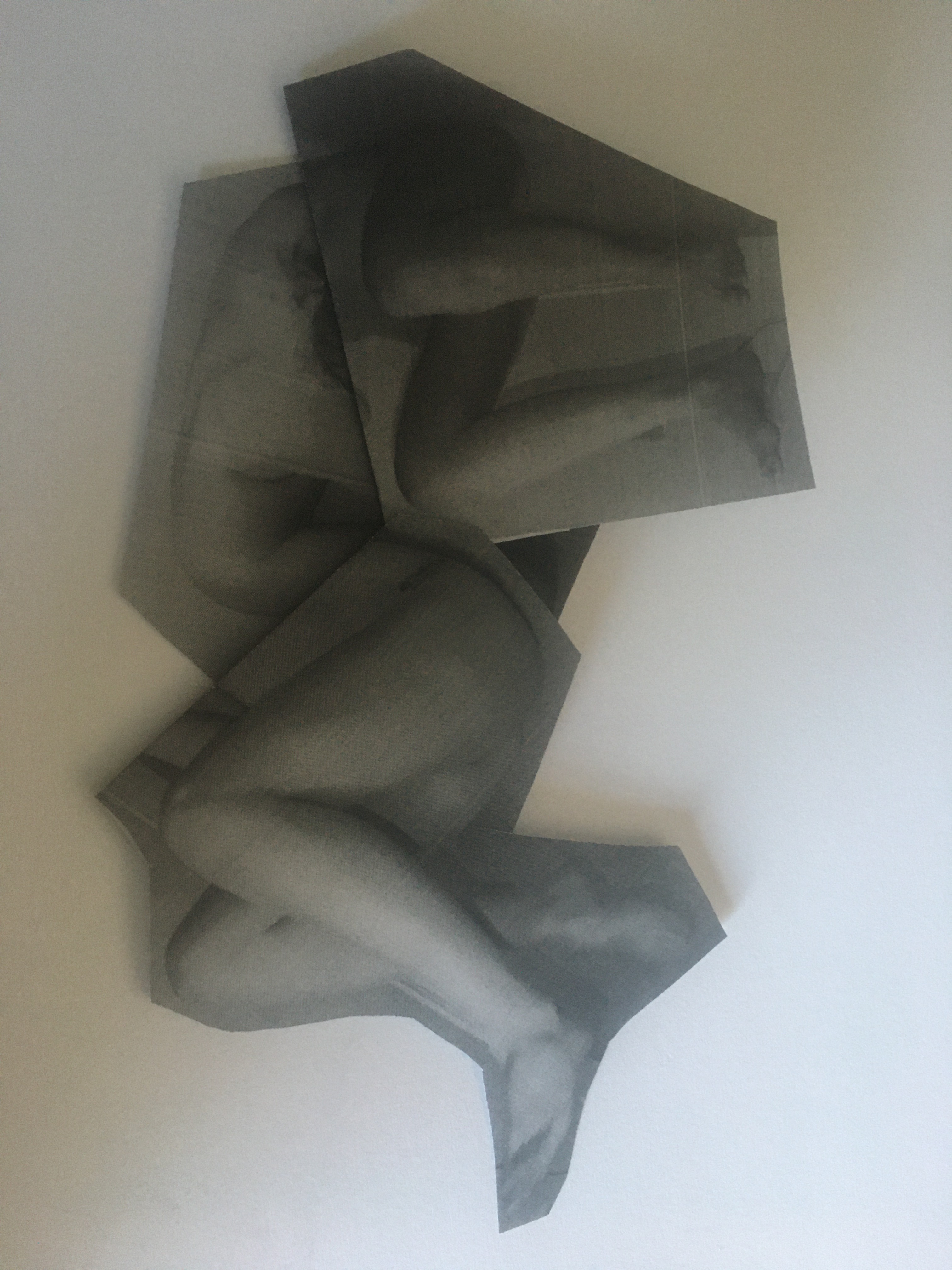
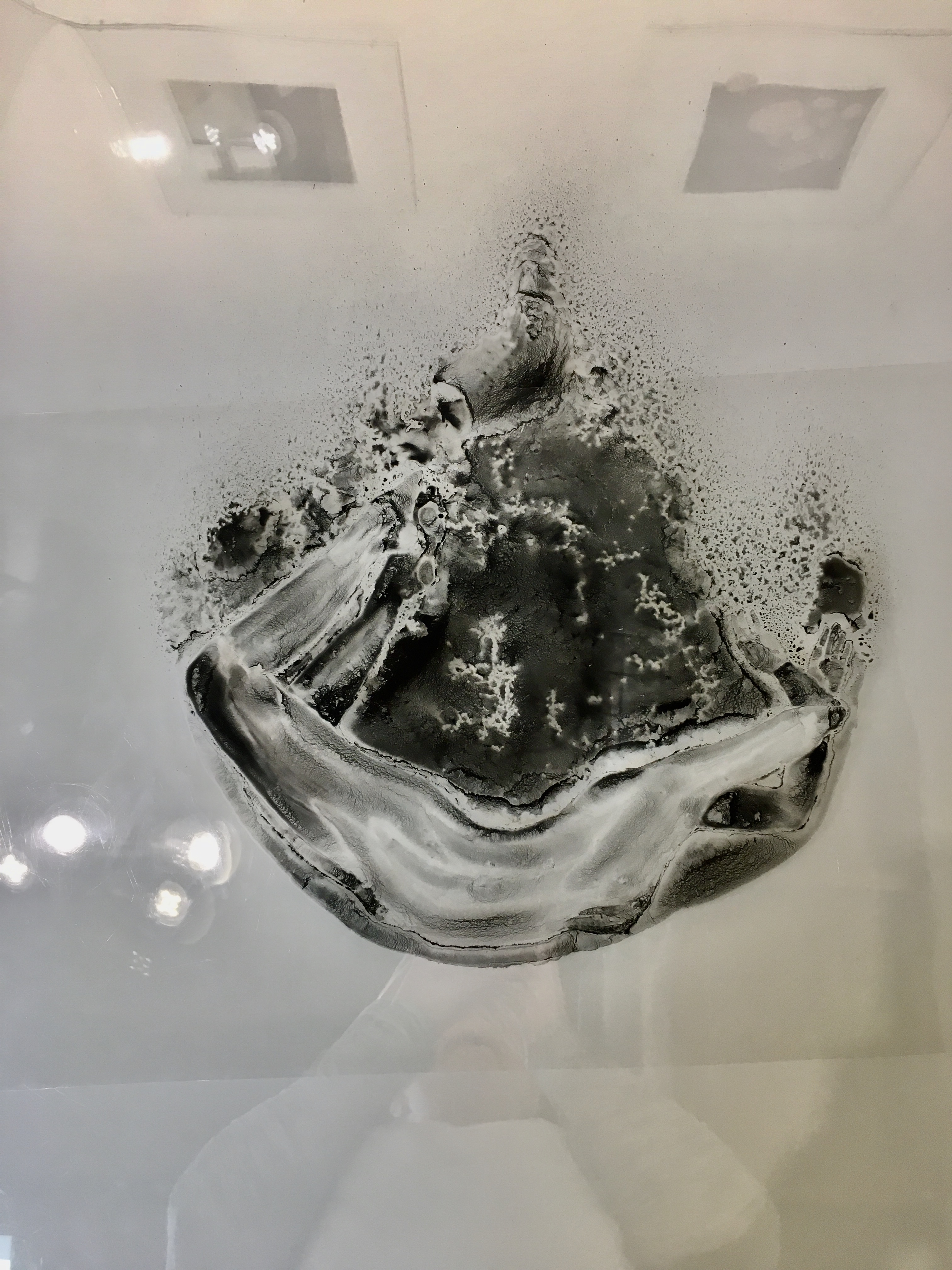
Since receiving the McKnight Artist & Culture Bearer Fellowship in Printmaking, I have been working on some paper sculptures and a collagraphic series incorporating text from 7 Seconds. Using garments once worn by my young children, I have transformed them into collagraphs and explored several ways of creating prints from them. Some exist as embossments, others inked and printed. Chine-collé and embroidery are used for other elements in the print: mimicking fabric, text on tags, or small garment details. The transformation of the garment to a printing matrix is a paradox, destroying the garment in the process but creating something new, a remnant of what was there. This currently untitled series presents a reflection of loss and grief: of hopes of having a child, of a child since grown, and the loss of a child.

Hope – Embossment, chine-collé and embroidery © 2024


Process for Body Language

As part of my upcoming exhibition Body Language at Squirrel Haus Arts, I thought I’d talk about my overall creative process for the series.

Though the work culminates as photolithographs, my process begins with photographs. My creative methodology begins with photography, using myself or my husband as a model. For this body of work the photo sessions were an intuitive process, focusing on movement and positioning. Some images stood alone but most were then cut and collaged as printouts or manipulated as digital collages, to then work from to create simplified sketches.

Playing around with different configurations for Mind and Body

These combinations of images became creatures such as Brute and Mind and Body. Other images were combined because they would be impossible to photograph in one shot, such as Tower and Tower II. From these abridged sketches, drawings on clear film were created, using a solution that contains toner from laser printers.

Testing the toner solution
Waiting for toner to dry..
Some images needed certain areas to be blocked out during the drawing process. Here the figures in Tower need to blocked to create the background area. The figures and the background were intended to become two separate drawings/layers for the print
The two drawings layered upon one another
Blocking out for Tear
Detail of Tear
Final drawings on two layered films. The figure and the surrounding element were shot on separate light-sensitive lithographic plates.
The final print, ready to be pulled from the press

My final visualization was for these toner drawings to become photolithographs and screenprints. Both photolithography and screenprinting are techniques that require a “positive” image, in order for that image to be exposed to the UV sensitive surfaces of the photolithographic plate and the silkscreen. The opaque toner on transparent film makes the drawings ideal for these processes.

Exposure test and detail shot of Searching
Brute inked up and ready to go on the litho press
Pulling a successful proof of Brute
The Fight was unique in the series in that it was three prints layered over one another to create the actual final image. Here I’m deciding which order they should be layered in. One reason I wanted to print on gampi tissue paper was to utilize its translucent quality
Final version of The Fight
Editioning The Fight

I chose to print on lightweight, translucent paper (gampi tissue), to add to their aura of fragility, but to also prompt them to move with and respond to air movements in the gallery space.

Final installation for Tear (three versions)