
As part of my upcoming exhibition Body Language at Squirrel Haus Arts, I thought I’d talk about my overall creative process for the series.
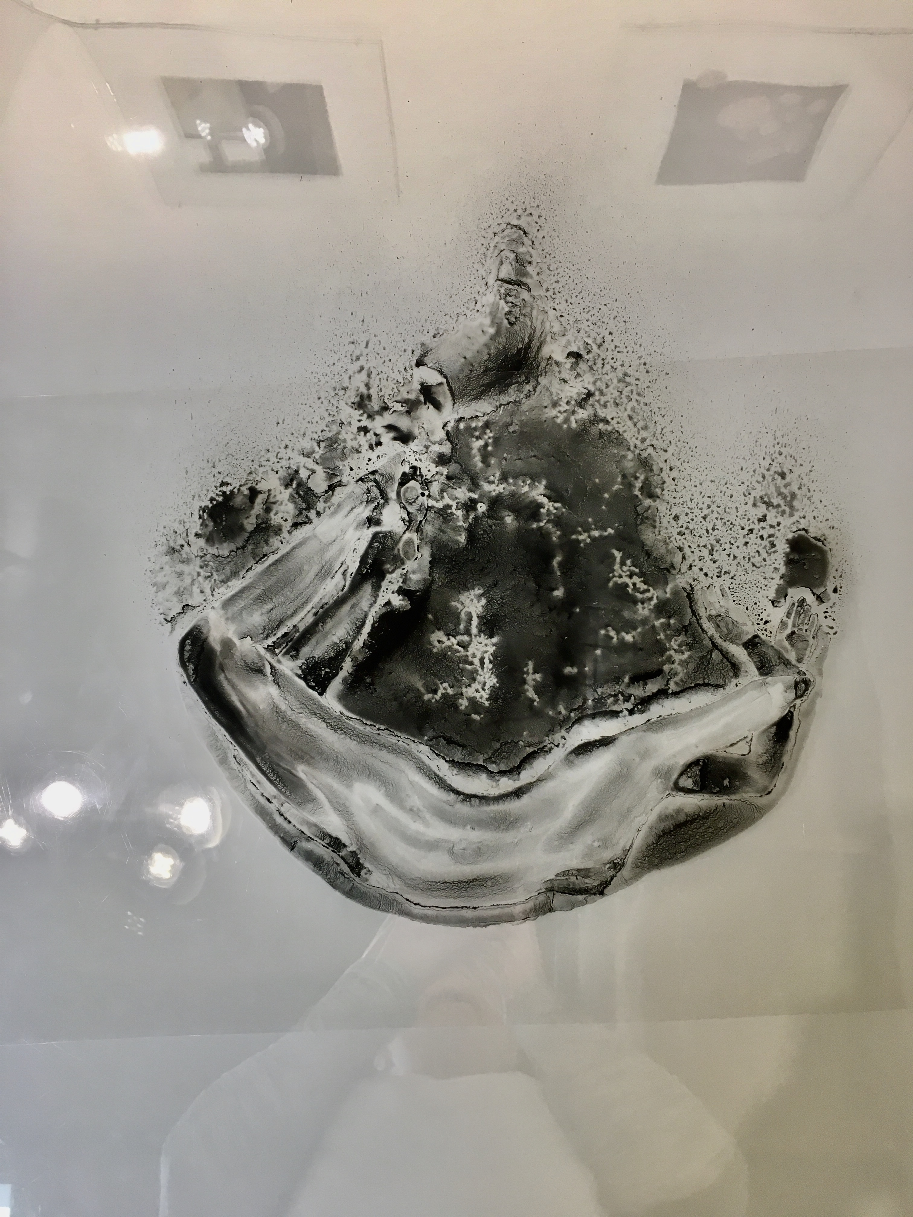
Though the work culminates as photolithographs, my process begins with photographs. My creative methodology begins with photography, using myself or my husband as a model. For this body of work the photo sessions were an intuitive process, focusing on movement and positioning. Some images stood alone but most were then cut and collaged as printouts or manipulated as digital collages, to then work from to create simplified sketches.

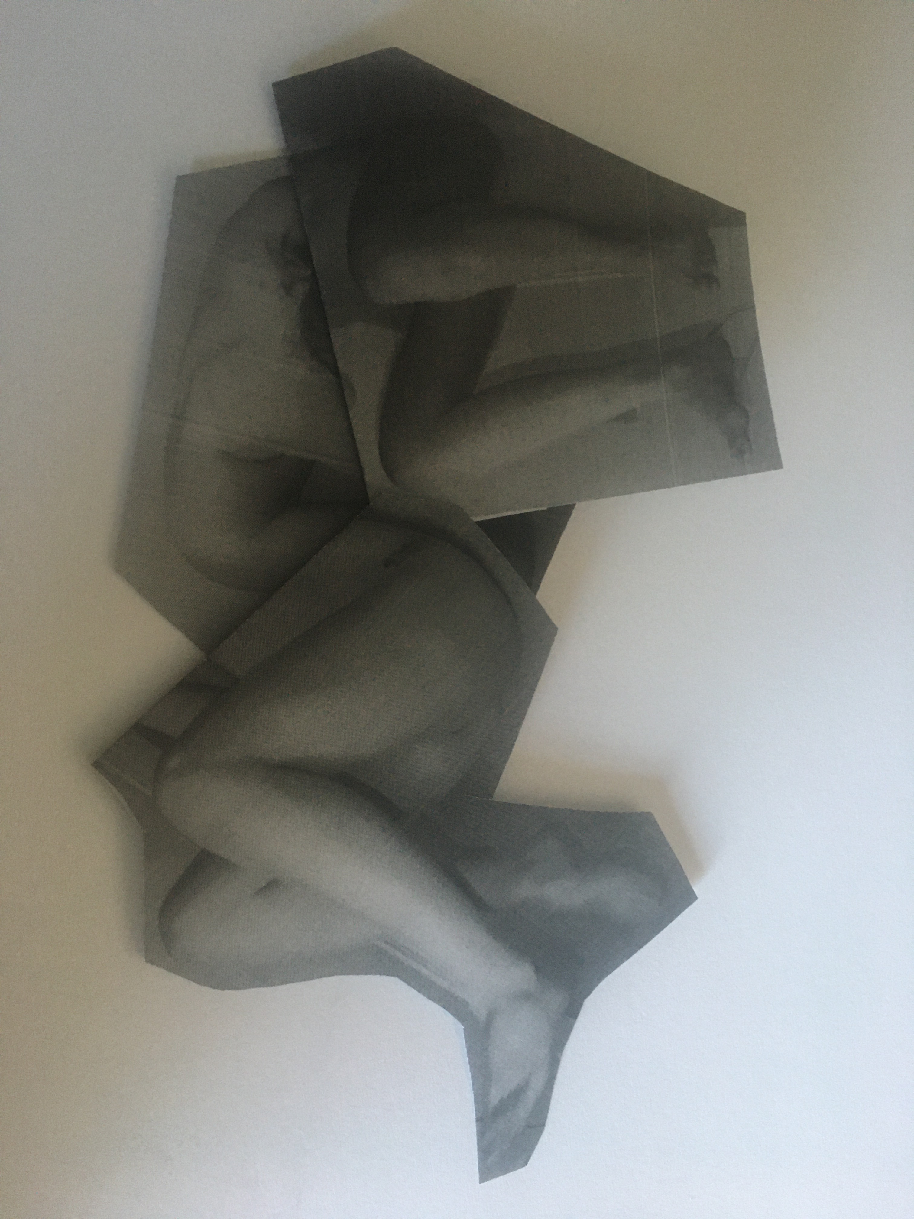
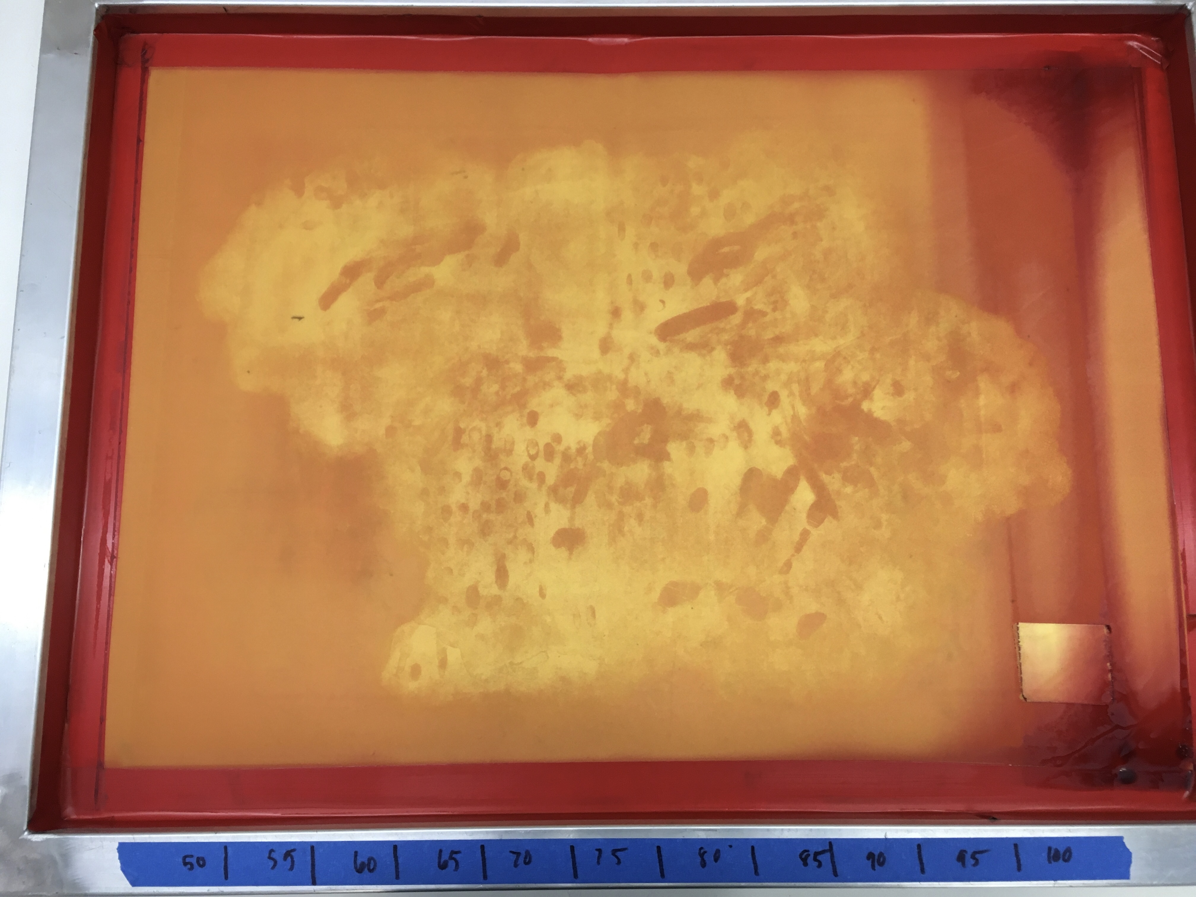
These combinations of images became creatures such as Brute and Mind and Body. Other images were combined because they would be impossible to photograph in one shot, such as Tower and Tower II. From these abridged sketches, drawings on clear film were created, using a solution that contains toner from laser printers.


My final visualization was for these toner drawings to become photolithographs and screenprints. Both photolithography and screenprinting are techniques that require a “positive” image, in order for that image to be exposed to the UV sensitive surfaces of the photolithographic plate and the silkscreen. The opaque toner on transparent film makes the drawings ideal for these processes.


I chose to print on lightweight, translucent paper (gampi tissue), to add to their aura of fragility, but to also prompt them to move with and respond to air movements in the gallery space.
